The behavior of 21st-century consumers is rapidly changing, forcing entrepreneurs to continuously look for new ways to get their attention and dominate the marketplace. Even though 2020 has brought us extreme challenges due to the global pandemic, moving towards innovations and emerging technologies is vital in creating convenient and appealing UI and UX. In 2019, more than 4.13 billion users used the Internet to solve their daily problems, do online shopping, and other purposes. With this in mind, companies are striving to implement the latest trends in UI/UX to bring excellent user interaction with their platforms. In this article, we will explore 13new UI/UX design trends for 2021 to stand out and explore outdated technologies that are better to leave in the past.
1. Big Visual Elements
Have you ever visited a website where you can barely catch the text on the picture because it’s too small in size? Well, these days, websites would rather be following the statement, “the bigger, the better.” Webpages usually store a vast amount of information for the user’s awareness. In 2020, web development teams generate big and bright images to attract users' attention to the company’s offers. Usually, these images have clickable texts to transfer the user to another page and not overload the main page.
2. Black or Dark Themes
Quite a significant number of platforms are now displayed in dark modes, and here is why.
It is ultra-contemporary and moderate. Usually, neutral colors represent a company's services in a formal and serious way, meaning that its products aim to resolve users’ biggest issues.
It is easier to highlight key information in different colors. Dark user interface design allows you to present information in other colors, such as yellow, red, white, more effectively.
It is better accepted by human eyes. In daylight or nighttime, black color strains the eyes less, which is useful for people who use computers a lot.
Many platforms give their users an option to select the background color or activate the black mode when needed. For example, Facebook’s messenger offers many color variations that can be changed based on a user’s mood or preferences.
3. Layering and Shadows
One of the trending approaches in developing a UI for a website with a touch of style and sophistication is soft shadows and layers within the 3D pictures. The layering is often applied to buttons to signify its clickability. Both techniques are an excellent solution to bring more reality to a virtual platform since all objects in real life are seen with shadows and are three-dimensional. However, it’s not only about functionality. It’s also about showing users the high level of UI and UX design services.
4. Virtual and Augmented Reality
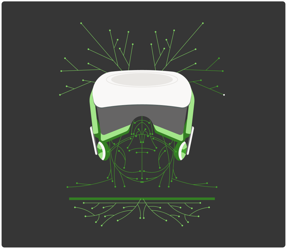
Without a doubt, VR and AR are the hottestUX trends that have slowly but progressively moved us away from traditional technologies. These approaches are no longer attached to a particular industry. They are used in everything from learning platforms to healthcare applications to gaming. The features of VR and AR provide more than just user-website interaction - it is communication, understanding, and easy usage.
National Geographic creates engaging virtual reality content. It does a great job taking advantage of natural sound and contextual display to walk users through the VR content
Charles Kim
5. Voice Recognition
The second most popular among the latest trends in UX design goes to the voice recognition technique. In 2019, more than 3 billion web and mobile applications use voice-based assisting features. Even more breathtaking is that this number is forecasted to grow up to 8 billion. Voice recognition is not only used in search engines like Google or online translating applications. It has expanded its use to doctor appointment apps, navigation platforms, and more.
6. Video Tutorials
When users visit a webpage for the first time, it is crucial for them to know what it is and how it works. Considering that it takes more time to read and understand, presenting a short video will make a difference. A 2-4 minute clip should briefly summarize the information about the platform, highlight its key features and what problems it solves, and demonstrate a “call to action” reason for using and buying it. The purpose of this effective move is to mitigate the user’s confusion and make them stay on your website rather than closing the window forever.
7. Think Out of Box
The Internet is overwhelmed with applications and websites that use boring and typical patterns: same fonts for menu sections, no interactive images, standard pictures, and no visual elements. Nowadays, a user wants uniqueness, custom features, and “a dialog” with the platform to get the feeling “I need it now!”. Companies have started to present their services less formally and increase the interaction with users to make it more personal. This approach helps them understand their users better - what problems they are solving - to fill a gap in their daily needs.
8. Code-Based Development Steps Away
If this UI/UX trend sounds confusing and impossible for you, we will explain how it works. The performance of developers and UI/UX designers is closely interconnected, thus requiring more communication and agreement between these teams. With this in mind, designers tend to create web and mobile platforms without codes to gain independence from engineers. The no-code approach allows designers to be freer to implement changes or modify both front and back-end development in a timely manner. It’s beneficial for users as they get needed services in the shortest time, and for a company, it is convenient as no extra costs for developers are included. It might be best to store all files on a cloud so that all team members have access to them and can work independently.
9. The Use of Atypical and Creative Fonts
In the fight for winning users’ attention, some leading companies have moved away from boring and typical fonts and now incorporate fonts with pictures to gain a competitive edge. Most of the time, introducing information in a creative form is useful on the landing page. While at the same time, other sections have images and background text to get into the user’s subconsciousness.
10. Split Screens
Blocks and sections are great, but not in the upcoming 2021. Asymmetrical web design trends are becoming more popular because they combine textual and visual elements on one page. For instance, the website offers furniture materials. For the landing page, it would be useful to split the screen with a diagonal line. The right side would explain the materials’ characteristics, and the second part shows ready-made furniture as an example of how it will look.
11. Storytelling
Providing evidence of an app’s or website’s usefulness via user stories has an immense potential to convince clients of the product’s need. Storytelling is actively implemented as the latest mobile app design to ensure an emotional connection with the users. These user stories are generated on the discovery phase of every development process and often pop up on the screen to inform about useful features.

12. Chatbots
This user experience design is expected to reach $1.25 billion in revenues by 2025. Chatbots are actively utilized on e-commerce platforms, healthcare, and financial-oriented applications. Small and large businesses and startups use chatbots to provide quick assistance, answer crucial questions, and guide users.
13. Content
It may seem that the blog section doesn’t bring much value to the user experience. However, these days, good and detailed content makes your website or application work. Articles give insights on the advantages of your product or service, demonstrate useful tips and recommendations, and link to other sources of information regarding your company. Here, the design process lies in inserting appropriate pictures and infographics to increase the text’s readability and comprehension.
14. Full-Screen Option for Mobile Use
We all know how it feels when a website is opened via mobile browser: small icons, barely readable text, blurred images. UX design trends give so much freedom to make the website scalable and satisfy your users without developing applications. Since Apple and other mobile manufacturers are introducing borderless devices, it is much easier to offer iOS and Android users to open the website in full size, customized for mobile use.
15. Dynamic Scroll
Folding and unfolding elements, text blocks smoothly appearing from the right or left screen side, and 3D company branding are new trends in UI design that can differentiate you from others. All these elements are appearing when a user scrolls down and disappearing when scrolling up. Such a trend makes the platform more interactive and interesting.
Confused about UI design trends and User Experience technology? KeyUA designers are ready to help by building an up-to-date application!
Contact UsWhich UI and UX Design Trends in 2020 Will Kill Your App?
After exploring the best trends in UI/UX design, it is high time to find out risky and outdated technologies.
1. Complex Navigation
As soon as users enter your website or application, they need to see the menu bar to get to know your platform. Display everything clearly and visibly and highlight crucial information using graphs, tables, and images to create maximum interactive interface and experience for your visitors.
2. Vibrant Colors Rock
Boring interface and muted colors will cause your visitors to leave the webpage. With this in mind, consider applying one of the mobile design trends we explained earlier - black mode with bright colors.
3. Flat Design Solution
Users would rather use a platform with 3D elements, shadows, and layers as it makes the content more visible and comprehensive. A flat clickable button may go unnoticed if you don’t give it a real-looking shape like a real button.
4. Ornaments to Divide the Page
We all remember these decorative elements in the middle or at the end of the page, like from the old book. Now, it is better to split the screen into two parts using 3D graphics, animated images, or other hotUI trends to separate information blocks.
5. Stock Photos
If you still use stock photos for your website, stop it. Creating unique and customized images that display your product and explain your services will show professionalism and expertise in the domain. Moreover, randomly inserting images in the article has nothing in common with readability and understanding. Make sure you select an appropriate picture to represent the content.
Key Points
Keeping up with the latest UI and UX design technologies is a proven way to get users’ loyalty and recognition. To compete in the marketplace means implementing current tools in creating 3D elements, animated images, and interactive text blocks. Constant market research may give you more information about the latest trends, your competitors, and your audience.
In 2021, a customer will expect you to show more interaction and customization to fulfill their needs and solve daily problems. For this reason, make the changes and move away from old-fashioned web design techniques. At KeyUA, we carefully analyze your business needs and select a customized set of UI/UX design patterns.
Do not hesitate to contact KeyUA if your application is outdated. We will implement the latest mobile UI Trends and create an unforgettable user experience!
Contact Us




 Unit 1505 124 City Road, London, United Kingdom, EC1V 2NX

Comments
Leave a comment