
Customer behavior in the insurance sector has changed over the last few years. More and more clients prefer using online services to communicating with agents in person or visiting the insurer’s office. Thus, a website has become an important channel for attracting new customers and generating sales.
As a result, the requirements for an insurance website design and UI have changed, respectively. Clarity, ease of use, the shortest possible user journeys, personalized guidance are just to name a few.
See how today's TOP insurance providers utilized all these principles in their websites. Get inspiration for improving your digital engagement capabilities with the right website design.
How To Evaluate Insurance Website Designs?
Traditionally web designers try to look at their design projects from the end-user point of view. They do their best to understand how to maximize users’ comfort while using the website.
However, a website design for an insurance agency should also follow the fundamental principles for increasing user engagement and converting traffic into leads and actual customers. Furthermore, a website is a business tool that operates to accomplish the specific commercial goals of its owner. Therefore, visual web design and UI/UX directly affect business metrics.
Yana Trihub, KeyUA CEO, explains this relation: "Potential customers are directed to your website by the organic search in Google, online ads, or word of mouth. A smooth user journey down the sales funnel is decisive for conversions no matter where they come from. The right UI/UX design aims to make that path maximally quick and easy for a user: minimum steps with maximum value."
What Users Expect from the Insurance Company Website Design
People often build their impression of your business upon your website. Therefore, the way you present your services on the web will be decisive to win the heart of your potential customer. Here are the critical points they look at.
- Appealing visuals: the website’s color scheme, photos, and texts should look nice and credible for visitors, fitting your industry and target audience.
- Ease of use: it should not take long for users to find the solution they look for on the website and apply for the services they need.
- Navigation: it should be clear on what page a user is currently located on and how to move to the next logical steps of the user journey.
- Points of interest: if a particular statement, photo, or CTA (call to action) resonates with the user’s needs or requests, they get interested in trying your services.
- Personalization: users appreciate getting offers tailored to their requirements fast instead of wasting tons of their time learning the variety of available options and making the hard choice by themselves.
- Responsiveness: a website design template should be adapted for both desktop and mobile devices.
Essential Website Design Principles for Boosting Conversions
A company’s website should work as a lead magnet and sales booster to help an insurance business become successful. For that purpose, its design and structure should follow a few practical marketing principles:
- The suitable variety of choices. According to Hick's Law, the more choices customers are presented with, the more time they need to spend to make a decision and the less likely they will make a purchase.
- True value content: the website should not overload visitors with tons of information and hard-to-digest terms. The website content should focus the customer's attention on its products and services and answer their questions precisely.
- Effective Calls-to-Actions: CTAs need to be clear in terms of visibility and desired action. Using multiple CTAs on the website pages makes sense because users tend to ignore one CTA and take action on another. Behavioral CTAs are also applicable to catch the users’ attention when they are ready to sign up, contact an insurance agent, or apply for a policy.
- Well-thought and high-quality graphics: HQ images, human faces similar to portraits of your target audience create the right psychological atmosphere where a potential customer feels comfortable and loyal.
The website structure also should be SEO-friendly and suitable for various online marketing activities and analytics.
We’ve collected 11 insurance website design samples that combine the best ideas from both approaches, user-centric and sales-boosting.
KeyUA helps insurance companies create effective customer generation channels through high-end web and mobile applications. Improve your insurance business with the use of our insurance software development services.
1. Trusted Choice

Trusted Choice is the biggest US online insurance directory that offers customers personalized search for various types of insurance plans. TrustedChoice.com became a winner in Best Insurance WebAward 2020. Seven million online shoppers annually use the website to find a perfectly matching insurance policy and connect to the right independent broker in their neighborhood.
The website design features a mobile-friendly structure that makes it comfortable for use on any screen size. It is made in calm white-blue colors with bright orange accents on all action points. The homepage features a classic landing page structure with dozed text portions to explain how the service works and the key benefits. It also shows testimonials and gives access to insurance information from industry experts, writers, and trained staff.
A user is given options of how they can use the website. For example, they can directly move to a questionnaire to find the right insurance contractor or learn more about every specific service, insurance mechanism, and other related topics. For those users who do not use the Trusted Choice mobile app, the website is a great tool to use most of the company’s services with ease.
At first glance, you may find Trusted Choice’s designer be a bit outdated and too plain: no textures, fancy UI elements, rich graphics. However, the user’s attention is focused on the services and CTAs. Therefore, the website creators managed to present enormous amounts of information in a compact, digestible way.
2. Country Financial

Country Financial is an American insurance company that provides home, life, and auto insurance coverage options. It also offers services for education funding and retirement. The company’s website communicates with visitors in a friendly manner like it is a conversation in person. The first thing that catches the eye is their key message, “You can expect more.” A CTA button leads to a form to find a local representative in the user’s location.
Country Financial’s website is mobile-friendly and features a lightweight design layout with compact text sections. In 2019 it was named the best mobile insurance website by The Web Marketing Association. It is one of the best insurance website design samples for effective use of negative space. All empty spaces on the pages are smartly used to emphasize the main action elements - clickable icons and text buttons, forms, etc.
The website offers to connect a company representative by submitting a contact form, making a phone call, or starting a live chat session. A user can also request a quote for the required coverage after filling in personal details.
There are no complex graphics or animations. Instead, pretty basic UX design elements let the website load and work fast, even with a slow internet connection. Simplicity, transparency, and the proper allocation of all action elements are what make Country Financial's website one of the best in the industry.
3. Insurify

Another great example of how an insurance website should look is Insurify. This insurance comparison website gives users options for the requested type of insurance based on a detailed questionnaire. Then, right on the homepage, it offers to fill in all necessary details to get suitable offers from partnering insurers in the USA.
Again, you won’t find any fancy graphics that may distract from the primary user goal - find suitable insurance coverage. Instead, the resource focuses on personalization, valuing visitors’ time and comfort. It also has a blog section where its experts share industry news, prices, compare services from various insurance providers, and explain how it all works for a customer. Unlike previous samples, this insurance website design is made in more colors, creating a positive mood by HQ photos in blog posts and other pages.
Whatever page you go to, you will always find a CTA button on the top and the bottom, engaging a user to ‘Start Saving’ and ‘Compare Quotes.’ Thus, the user can start using the service from any point of their journey on the website.
4. Zurich Insurance Group

Zurich Insurance Group provides insurance services globally. Therefore, it was essential for the company to design its website tolerably for all countries and nations it services.
The main website features a photo of an interracial gay couple in a happy moment of getting married. However, when you visit the local company’s website for UAE, you will find a nice picture of crystal water with a lifeline. Water is the most valuable resource in the Rub' al Khali desert, while the lifeline symbolizes insurance. Designers found suitable images for each country.
While looking pretty laconic and straightforward, this insurance agency website design features lots of exciting perks:
- A Zuri chatbot that helps quickly register an account and manage policies or file a claim.
- The gamified learning process explains to users the basics for each insurance type.
- Relevant action points on the right places of the user journey.
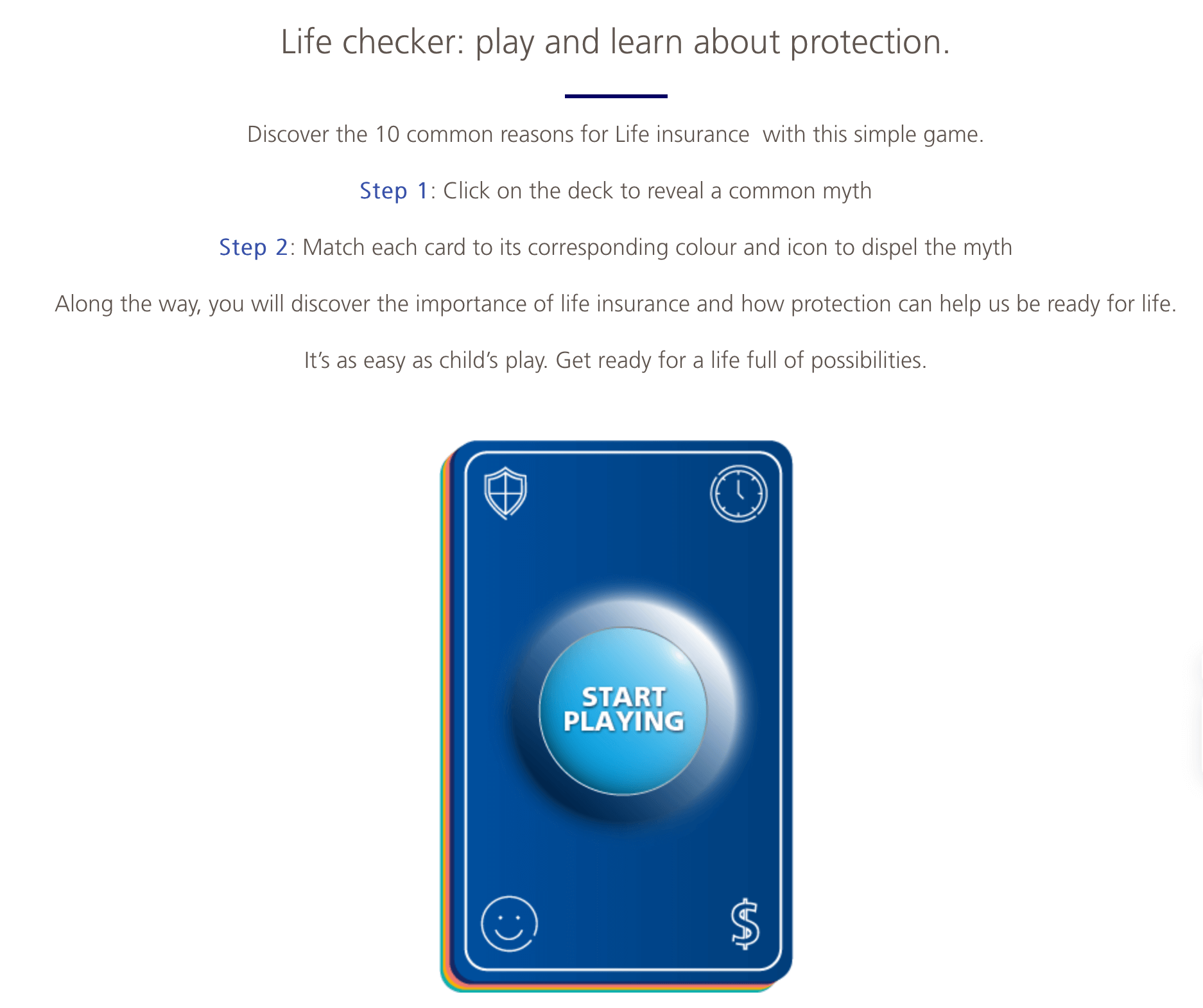
Gamification of Learning Process on Zurich Insurance Website
As a result, the website gets high user satisfaction rates. Its design definitely plays a significant role in that positive feedback.
Bring a modern look to your insurance agency website with an innovative design from KeyUA.
Contact Us5 Ping An Health

Ping An Health is the #1 ranked website in Similarweb Financial>Insurance category list. It belongs to Ping An Group, which sits in 16th place in the 2021 Fortune Global 500 list.
Ping An Health Insurance’s motto is ‘A local presence with global expertise.’ The company offers individual and corporate insurance plans alongside various health management products to completely cover healthcare needs in the local Chinese market. Its website features a complete overview of the company’s services, offering to contact the consultants for any questions. Right from the homepage, a user can subscribe to Ping An Health channel at Wechat by simply scanning a barcode from the screen.
The colors are traditional for Asian designs - orange and red palette with contrast sky-blue elements. The website opens in Chinese by default with the ability to switch to English. However, the English version is not perfectly localized, with much text staying in Chinese. 95%+ visitors are from China, which explains this shortage: the company doesn’t focus on international visitors.
The website is not perfectly responsive. If you try to stretch or squeeze the browser window, you’ll see many elements moved improperly. Well, perhaps one of the most valuable insurance brands in the world can not care about such faults in their website design layout.
6. Generali Group

If you think that insurance website designs are all boring, check Generali Group. It is an Italian-based insurance provider with a presence in five continents (excluding Australia).
Unlike most insurance websites that aim to convert visitors to leads and customers, the Generali site serves as an info center for those who’d like to know more about the company profile, services, insurance industry news, and various reports. The site contains lots of infographics to present tons of information in brief and neat form. You won’t find any CTAs or even a contact form there. It is more like the company’s portal telling about its history, achievements, services, etc. And all that is presented in Generali’s unique brand style.
7. Allianz

Allianz Group is the leading Europe-based financial services provider with insurance as one of the top business directions. Its main website presents the company profile and connects visitors to its regional subsites and contacts. In addition, the regional sites show different information based on the services offered in a specific country.
Allianz group focuses on different services depending on location, starting from personal life insurance and finishing with industrial risk assessment services and property insurance. However, all company websites are designed in a similar style, featuring the same corporate identity. In addition, each website is properly localized for native users.
8. Aviva

Aviva is a London-based insurance company that has 33 million customers in 16 countries around the world. When entering the company’s website, it opens as a corporate site. However, a user can quickly switch to the UK Customers section or select any local version for the supported countries. The corporate homepage shows a welcome video which is rarely found on insurance websites. It looks great and loads fast:
The UK Customer section moves a user directly to the company's services. It offers to get a quote for car, home, life, or health insurance, as well as learn more about Aviva's financial management services. The general look and feel of the Aviva website are great: it has no extras, just necessary information right to the point. In addition, the UI designers worked hard to minimize the number of steps users need to make for applying for the company’s services.
9. Shaw, Moses, Mendenhall & Associates Insurance

SMMA Insurance is a California-based insurance firm with a website design emphasizing personalities and individual approach to every customer. If you check the site pages, you’ll find many photos of the company’s team and their working process.
There are no policy matching functionalities on the website. If a user wants to apply for the SMMA services, they need to get in touch with the agents directly through the contact form.
Overall the SMMA Insurance website gives an impression of a company with traditions, transparent and reliable services, and an attentive attitude to every customer. However, it doesn't boast any UI/UX innovations yet works flawlessly on any screen size.
10. Guardian Life Insurance

The Guardian Life Insurance Company of America is a US nationwide agency providing life insurance. Having lots of human photos is typical for any life insurance website design. However, the Guardian website also features lots of graphic illustrations that are slightly confusing. In addition, painted faces without eyes and other traits feel a bit unemotional and impersonal.
Nevertheless, the website's usability is excellent. Users can get a quick quote on the desired insurance types right from the site. There are also short explanatory videos for all available services and coverages, which is great if a user doesn’t want to read tons of information. The UI is clear and well-balanced in terms of readability, content distribution, white spaces, etc. It is mobile-friendly, but the pages look different on the smartphone screen: you won’t see many images available on the desktop.
11. Pet Assure

Pet insurance is a popular type of insurance that helps save on veterinary bills and get additional services like lost pet recovery. One of the best service providers in this niche is Pet Assure, available in all 50 US states, Canada, and Puerto Rico.
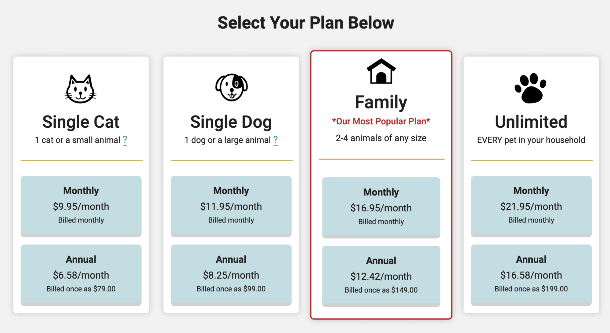
Pet Insurance Website UI
The website is full of nice animal pics and graphic icons. Its structure is compact and well-thought, giving users the ability to find any information they need quickly. Here a user can quickly apply for the chosen plan, read more about each coverage type, and find a veterinarian by address or zip code. All those features are easily accessible and clear to use.
Final Thoughts
The websites of leading global and regional insurers are still far from innovative in most cases. Currently, insurance companies have lots of opportunities to stand out from competitors and give more exciting and engaging experiences for their online customers.
KeyUA UI/UX designers can help you make good use of all available technologies for this purpose. Moreover, our online marketing experts can turn your insurance website into a powerful lead and sales generation tool.
With our insurtech expertise, you can be sure your insurance website design will best serve your business's comfort and commercial needs.
Create a cutting-edge design for your insurance company website with KeyUA UI/UX designers.
Get In Touch


 Unit 1505 124 City Road, London, United Kingdom, EC1V 2NX

Comments
Leave a comment