
Website navigation is an integral part of user interaction with your business. It is the foundation for growing your revenue. Poor navigation can ruin an impression of the website and company and thus lead to failure. That is why it is so important to think carefully and create a great design for your menu. In this article, we'll talk about what a menu bar is, its key features, and consider some neat ideas.
What is Website Navigation?
Website navigation is a process that allows users to navigate through the pages and elements of a website or web application, providing access to all content and functionality. Without a proper toolbar, your customers will not be able to find information about your company, blog, list of products and services, help documentation, prices, and other important pages.
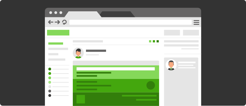
Web site navigation is based on hypertext or hyperlink technology. Hypertext is a system of text pages that is cross-referenced (with hyperlinks) and leads to other web pages on the site. By and large, the website’s menu is represented by internal hyperlinks that open the content the user needs using URL addresses.
Why Is Navigation Important on a Website?
Easy navigation is paramount for any web product. Your website may be hi-tech and super creative, but you will get low user flow if it has poor navigation. The site menu bar is directly related to user experience. According to statistics, about 70% of online businesses fail due to a poor user experience.
Here are some more reasons why good navigation is essential for any website:
Users have a clear idea of what information they can find on the website.
It allows you to structure the website correctly, increasing its usability.
Improves the SEO by allowing search engines to crawl and index websites correctly.
Allows users to search within your system easily.
Navigation is an important tool for attracting new and retaining old users. At KeyUA, we apply the best web design practices to create the most effective toolbars.
I need a DesignTypes of Web Design Navigation
In the world of UI/UX design and development services, there are 7 main types of website navigation examples. While creating a website, you are not limited to using only one, and you can combine different types depending on your needs.
#1 Logo as a link on the Home Page

The website logo should be a link that leads to the home page in the main menu bar. It doesn't matter what page the user is on.By clicking on the logo, they should be redirected to the main page. These things seem obvious, but many startups neglect this feature. However, it is better to make the logo a link to the home page for the convenience of users.
#2 Primary and Secondary
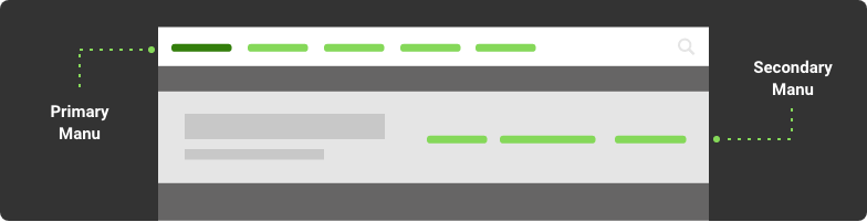
Both of these navigation types redirect the user to specific website content. Primary navigation usually includes the most important information that should be immediately available to users. It should be as clear and convenient as possible and may include such sections as 'Services' 'Price' or 'Download', depending on your business’s aim. If you sell services of any kind, then the primary navigation should contain a list of the most relevant sets. If you sell products, then there should be a link to your catalog.
Secondary navigation is also essential, and it is usually placed on a page that is accessed through the primary menu. It consists of additional elements that have a less pronounced design.
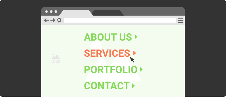
#3 Horizontal vs. Vertical

The horizontal link list is one of the most popular types of web navigation. It is a great solution for those websites where the main navigation needs to be presented with a small roster. It can be implemented using graphics or simple HTML.
Vertical navigation is also used on many projects, but it is more suitable for large-scale websites that require a long list of hyperlinks. It is usually located on the left side of a web page, and it can also be used as a secondary panel if the horizontal menu is the primary one.
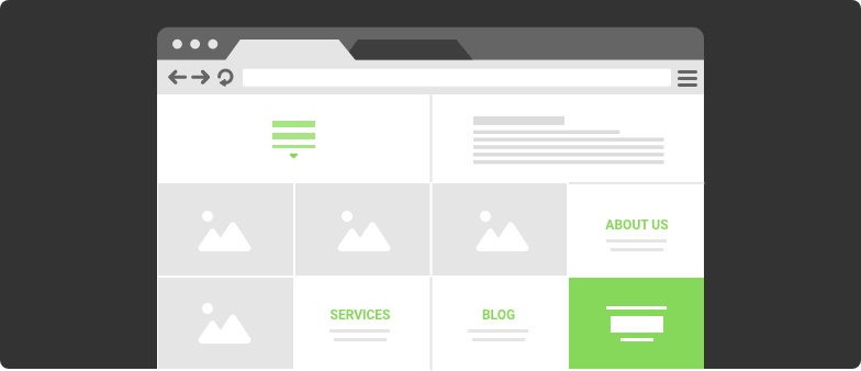
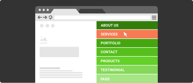
#4 Drop-down Menus

Dropdown menus are often used in conjunction with a horizontal panel. When you hover over a menu item, a huge panel opens with additional lists. This type greatly simplifies the display of many options, allowing the user to navigate the main sections of the website and various subsections. Dropdown lists with horizontal navigation are a good solution for e-commerce websites where large lists with categories should be nicely hidden.
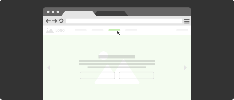
#5 Sticky/ Fixed

Another popular navigation bar design is to fix the main menu to disappear while users scroll the page. It usually applies to horizontal lists. Website visitors can view any content on the page, while the main menu will always be presented in front of them. This makes travel more convenient and faster.
#6 Fat Footers
For a very long time, footers were underrated in web design. This is now a great place to create easy navigation around your website. Content-heavy projects use a footer to link to important platform parts and information, allowing users to clearly see what's available and get to the right parts of the website or application.
#7 No Navigation
Another beautiful example of website navigation design is that it can be integrated into layout elements, and the menu is absent at all. This works well for small projects with just a couple of pages. It is an elegant and laconic logic, which makes the website unusual. However, this is a bad idea for scalable projects such as e-commerce platforms, as the more extensive the website, the more complex the movement through a website will be.
The type of menu panel, in some cases, can be interconnected. If users are expected to enter the website using laptops, tablets, or smartphones, this is simply necessary. So we come to the last type.
#8 Responsive Design Navigation

Another aspect to consider when preparing your website menu is responsiveness. It makes the page look good on all screen extensions. In this case, the main bar turns into a hamburger menu. This is a well-known icon consisting of three horizontal stripes. A hamburger menu is used on mobile devices, where you need a compact and easy website navigation design. This is where a horizontal menu bar turns into a vertical one.
Boost your website's performance with premium UX / UI.
Contact UsCurrent Trends of Navigation in Web Design
Despite the fact that the principles for creating navigation remain the same, UI/UX designers have more creative ideas on stylizing it beautifully every year. Their main task is to make an unforgettable and convenient way to move through a website that distinguishes it from competitors. Here are some UI/UX design trends that will definitely not leave users indifferent.
Full-Screen Navigation
It’s about when navigation is a design. It is beautiful as well as very effective, allowing users to navigate the website easily. Full-screen navigation can be a powerful mix of style and content.
Animated Elements
Animation in websites has been actively used for over 5 years. Various products offer convenient ways for menus to appear on the page as users scroll. Animations can also encourage users to navigate to specific pages that are part of the sales funnel. In general, good navigation animation is simple and intuitive.
Middle of the Screen
Having buttons in the middle of the screen is another old trend that is still very popular. It allows you to focus visitors' attention on those features that are important to your business.
Card-Style Options
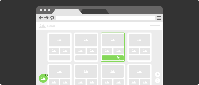
Loved by all Pinterest uses cards for everything, even to enable users to move through the website. It is a nice and convenient option for a broad audience. Users of all ages can easily figure out how to navigate the website. The principle of cards is even remembered in Google Material Design documentation, a guide to styling GUIs.
How to Create a Stunning Navigation?
Before you start creating templates, there are some important questions to answer. In the future, this information will help determine the most suitable type and how best to design the menu so that it is convenient and understandable for your users.
What is your potential audience (age, gender, education, location, income)?
What is their purpose on your website?
What information will be on the website?
What is the structure of your content?
What information is the most important to users?
How do you plan to organize the information modules on the website?
Navigation Planning
The hierarchy of your information is another crucial factor in the way navigation is rendered. Think in advance about what pages should be on the website and what elements the menu will link to.
Naturally, it’s better to use standard approaches for creating internal links, but this should be designed with your project’s specifics and goals in mind. Study your competitors and potential users’ behavior, as they already have certain habits when operating on the Internet.Good design is intuitive. For example, an e-commerce platform should provide quick access to a catalog, while an entertainment project contains simple elements that easily open the main content.
Tips for the Best Navigation Practice
We've prepared powerful tips to help you create quality navigation and improve your website’s user experience.
1. Obvious hyperlinks.
The user should understand that they see not just text but a link to other pages, so hyperlinks should be visually noticeable and distinct from other elements on the page. They can have a different font, text, or be underlined.
2. Optimize your menu.
Keep your navigation panel as comfortable as possible. It's not good if it has too many or too few links. A logical question arises, how many links should be in the navigation bar? Think about what important information you would like to provide to users and what is essential to the visitors themselves. The number and length of hyperlinks will be different for each project. For example, buttons with long names are best placed in a vertical menu, while a horizontal bar works well for a short list. Form your custom menu based on the features and peculiarities of your project. The only rule is that the menu should contain links to pages with important information.
3. Navigation availability.
Many sites overdo it with creativity, which ultimately complicates navigation. No matter how high-tech or futuristic your design is, keep the menu in a standard place to make it easier for users to navigate your site and understand what actions to take.
4. Make it reflect business priorities.
The toolbar is primarily for visitors’ convenience, but do not forget about your business interests. A useful technique for creating top-notch navigation is maintaining a balance between links to pages that interest users and links to items that increase your conversions and sales.
5. Make call to action buttons.
A call to action (CTA) is an essential component for any online business. It allows you to motivate users to take certain steps, for example, order your goods or services. Brafton, the content marketing agency, increased revenue by 83% in one month by simply adding CTA buttons to their article templates.
Increase your site's profits with quality web design.
Make a DesignGreat Examples of Innovative Navigation for Your Inspiration
With the basic theory in place, you can already start creating your own designs. But, you can always be inspired by ideas that have succeeded and adapt their strategies. Below are some stunning examples of website menu design that are trending and have won the love of users.
Netflix
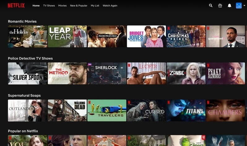
The popular streaming network has a blocky design that is incredibly simple and convenient for users of any category. The header has a main menu that offers options such as searching, navigating to popular movies or shows. The rest of the elements on the pages also have navigation. Each card opens the page of the movie, where users can read the description and start watching. Netflix navigation looks simple and beautiful at the same time.
GetCoverLetter
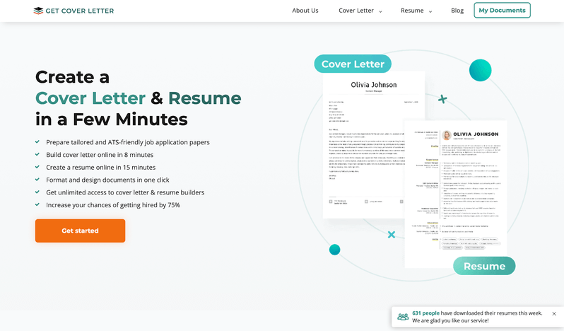
KeyUA built GetCoverLetter as a convenient platform for creating custom resumes and cover letters. Its main navigation style is a fixed horizontal menu bar that scrolls as the user goes down the page. This is very useful as it allows you to access the main content at any time. The site also has CTA buttons that motivate visitors to order services.
Adriatic Luxury Hotels
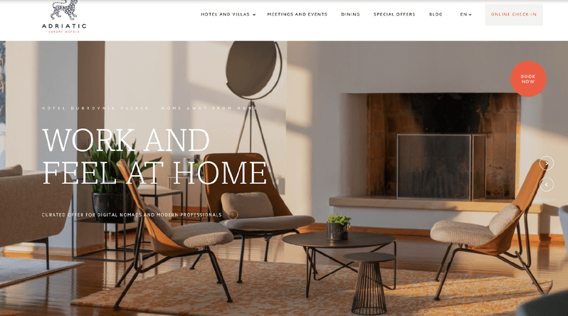
Adriatic Luxury Hotels provides booking services for luxury hotels and villas in Dubrovnik, Croatia. The site and its navigation have an elegant and simple design that reflects the spirit of the brand. It has a horizontal menu with links to the main pages of the website. In addition, some buttons are located in the center of the screen, clicking on which gives the user access to hot offers. The booking button is different from all others and has a richer color, which immediately draws attention. In general, the site’s navigation is clear and intuitive, which allows you to book the desired type of accommodation quickly.
La plus Grande Cave a Bieres
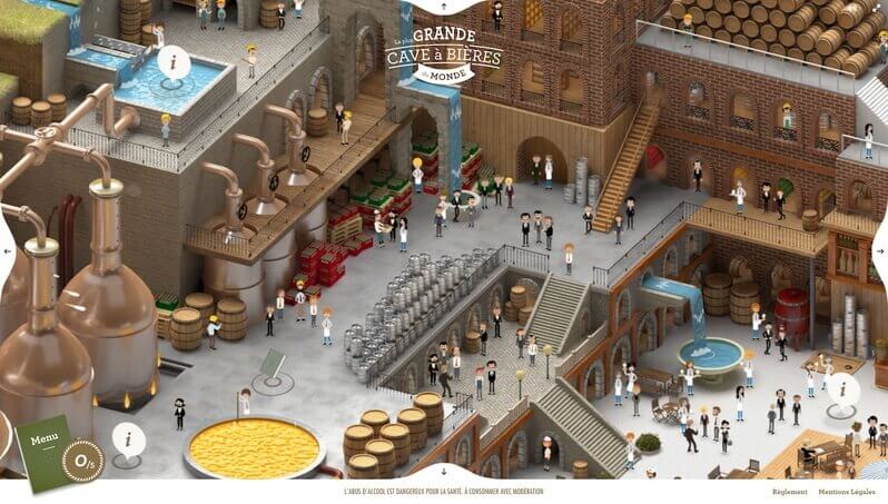
This is an award-winning HTML website. Do you see any menu panel here? The site is more like a game, and because of this, it captivates users. Unlike many other creative projects, there is no standard horizontal menu or vertical scrolling. Instead, users can move the screen in different directions, like in a mobile game, and discover new areas. However, there is still navigation. It is hidden behind some icons. In the screenshot, you can see the buttons ‘i’. When you click on them, a popup with information about the brewery opens.
Online Divorce
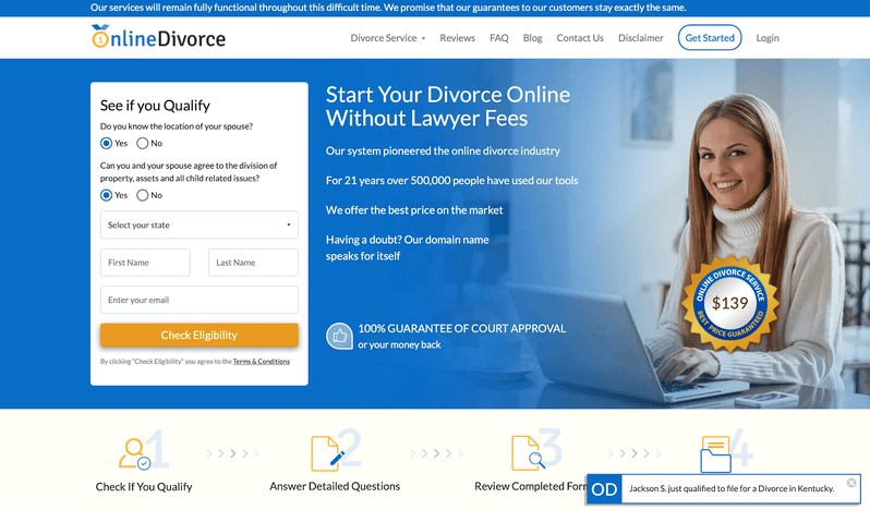
Online Divorce is one of the largest divorce papers providers in the US and Canada. Designed by KeyUA, it features intuitive navigation that makes it easier for users to access important information. The main menu is located horizontally at the top of the page. On the left is a secondary menu that allows users to start using the platform's services immediately. This is a very useful technique for engaging customers.
Seeing Data
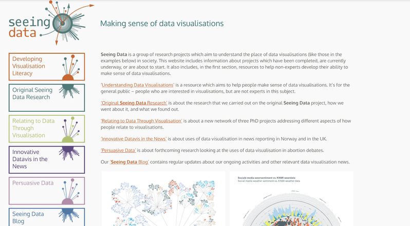
This website presents the activities of a group of researchers who work with data visualization. Their main navigation type is the vertical menu on the left, an excellent solution for large elements that would have a negative effect if they were placed horizontally. Such a design looks beautiful and interesting, and most importantly, it is convenient for visitors.
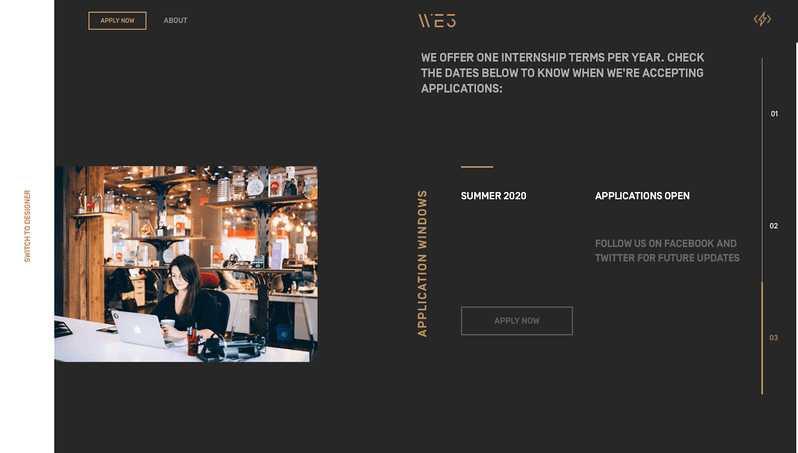
WE3 - Jam3
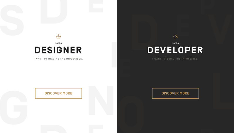
This internship program website was created by a design and experience agency to address various issues between people and technologies. The initial site navigation is creative and minimalistic. It is a screen divided into two blocks and two large buttons. When choosing the type of collaboration, the user is taken to the corresponding page, where navigation becomes a little more complicated and includes both horizontal and vertical menus and call-to-action buttons.
Final Words
The world of web design offers many ways to create a menu for websites. Good or bad, there is no universal approach to build navigation menu examples. The process depends on the characteristics of the website and the goals of the business. Ideas from other projects may inspire you, but completely copying them into your product may not lead to the expected result. That is why it is so important that your website design and navigation are unique and reflect the overall brand style.
At KeyUA, we have created trendy and first-class page designs for projects of any complexity since 2008. Our approach is focused on complete customer satisfaction and emphasizing the characteristics of their business.
Let a professional team bring a magnificent result for your website design.
Hire KeyUA

 Unit 1505 124 City Road, London, United Kingdom, EC1V 2NX

Comments
Leave a comment