Thousands of startups are created every day, but more than 70% of online businesses fail. One of the main reasons is due to poor user experience and usability. These statistics clearly demonstrate how important it is to think over the smallest details of product concept and design. If you want your business to be successful, you should take care of first-class software product design services. Today we will talk about what design principles are, why they are so important, and fundamental approaches using the example of well-known companies.
Product Design Principles

There are many terms like concepts, methods, tools, merits, and so on in the world of design. But there is one crucial aspect that is known as design principles. Startups that chose to ignore them have often failed, while big companies like Apple and Google build their digital empires based on them.
Product design principles help the development team and investors decide which direction to go when creating a product. The main goal of design principles is to define what the product will be focused on and how it will satisfy the user’s problems. Those principles also show what distinguishes the product from competitors, how you can get a competitive advantage, and what feelings the product can evoke in the end customer. This is an essential feature for marketing and sales, as 95% of purchases are driven by emotion.
In large companies, design principles unite a product line into an entire ecosystem, giving each of them a sense of completeness and value. A good product must be user-friendly and meet the needs that matter to clients. So design principles help to understand which area to direct forces to create a demanded product.
It's worth noting that there are many different principles of product design and development that can be combined, extended, or modified to suit business needs. But we'll first look at the basic concepts.
Do you want to make a user-friendly and reliable application with a beautiful and intuitive interface? Collaborate with professionals from KeyUA to achieve your strategic business goals.
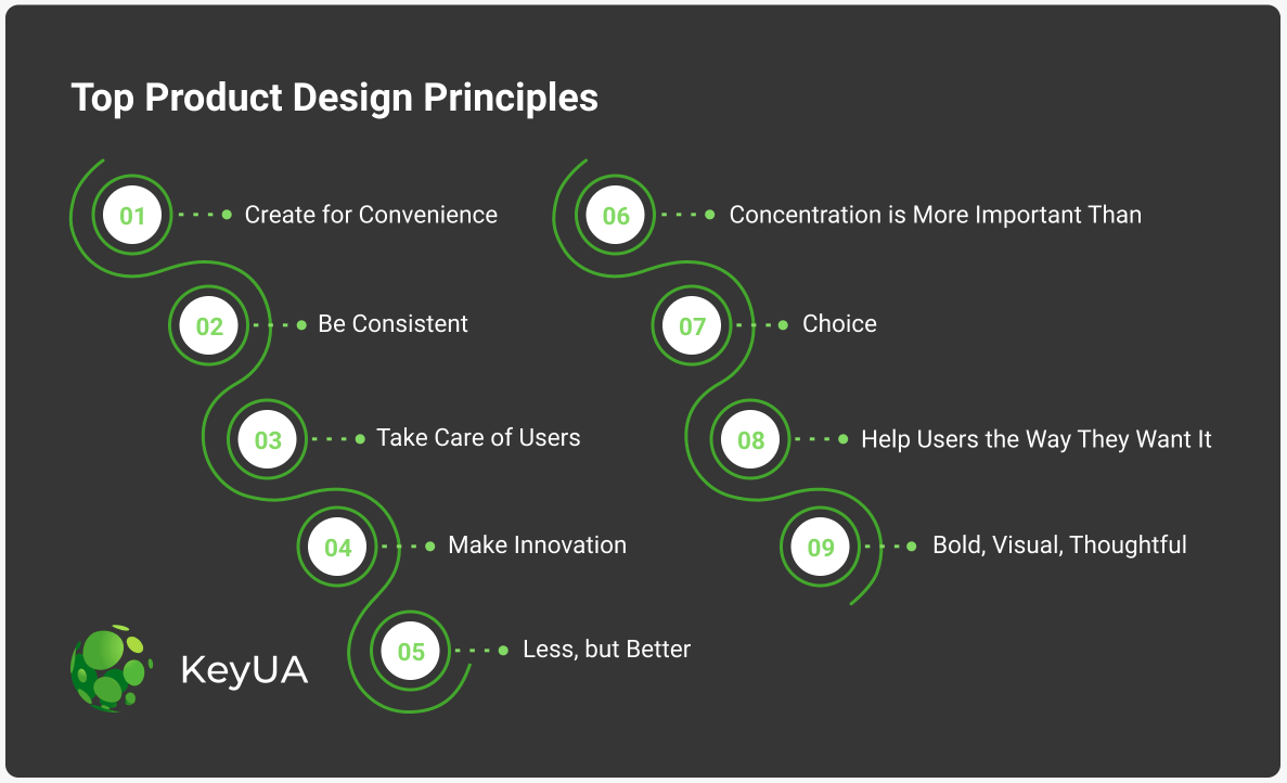
Contact Us#1 Create for Convenience
The application aims to help users solve a number of problems. They are built so that clients can use them daily and as efficiently as possible. The interface’s key elements are thought out to the smallest detail and located in the most convenient way.
Usefulness is one of Apple's most influential design principles. They even implemented it across the entire product line, making it easier to manage. If my iPhone is in my bag and someone calls me while I work, I can just take a call on my Mac without wasting time getting my smartphone out. If I want to watch a movie at home, I no longer need to look for the Apple TV remote control. I can easily manage it through iWatch. These seem like such simple things, but they greatly simplify daily operations. All brand devices are linked to one system, which is simple to operate and helps solve everyday tasks.
#2 Be Consistent
This is another fundamental design principle that many companies follow. As an example, you can see it on Facebook. This principle makes it easy to adapt to the product and improves the overall experience. The consistency is based on the use of templates, with which the product becomes noticeably more straightforward and accessible. It also increases user confidence in the product. When a new user opens Facebook, they immediately understand how to scroll through the news feed and make posts or short stories. And Facebook has transferred the same principle to Instagram. This makes the product available to a wide range of users with different needs and peculiarities.
#3 Take Care of Users
In 2004, the Firefox browser first came out into the world, and since that time, the company has released many versions, the main principle of which was the care of users. Mozilla Firefox has two essential features. First, the increased focus on safety. Over time, hacking technologies have also evolved, so users need new tools to protect their personal data. Firefox puts customer privacy as the top priority of the company. They also provide helpful tips on how to protect yourself from unauthorized online activities. This product design principle has made the browser one of the most popular in the world. In addition, Firefox offers users a wide range of personalization options, which gives them the ability to modify the browser in accordance with their requirements.
#4 Make it Innovative
In 2008, Brian Chesky and Joe Gebbia, the future creators of Airbnb, were still making ends meet. To afford to pay for their apartments, they leased out several mattresses in their living room. This is how the idea of creating one of the most popular websites for travelers was born. At that time, the market had no analogs yet, and it was an innovative idea that Brian and Joe firmly believed in. However, many investors just laughed when it came to attracting start-up capital, arguing that the concept is a failure. But the graduates of the Rhode Island School of Industrial Design did not give up. Their creative and innovative approach attracted the attention of Paul Graham, and Brian and Joe got into the startup incubator, and within a year, they received $7 million investments.
Airbnb was a real breakthrough. The guys hit the market and provided users with a convenient tool that helped reduce travel costs and had a convenient design. I remember when the site for rental accommodations gained popularity, and many startups came to us for project development and said, "just make it like Airbnb.”
#5 Less, but Better
This principle was developed by Dieter Rams, architect and designer for Braun. Subsequently, he held the chief designer position, where he implemented several fundamental principles that allowed Braun to gain worldwide recognition. Mr. Dieter's Principle says that simplicity and clarity lead to good design. Although this claim is over 70 years old, it still holds true for many industries. In an era of information overload, when simplicity and clarity of design are of particular importance, they help promote the product and gain customers’ trust—the fewer pitfalls in your project, the larger your audience.
Microsoft actively uses this principle in software development. They start with simplicity - a universal common denominator. When the design is intuitively simple, they know it for sure; you can feel it. The result is an honest and always up-to-date product.
#6 Concentration is More Important Than Choice
The next principle that is definitely worth paying attention to is minimalism. It may not be suitable for every business, but some products can benefit from it, such as the Medium. In developing its platform, the company focused on users' concentration. They deliberately ditched the choice of font color and style in favor of a standard template available to everyone. This approach makes sense when it is important to focus on the content, and nothing should distract attention from it. Concentration helps to keep the focus on the writing process and not waste time on unnecessary attributes. In the case of Medium, such a concept for the design was fully justified, and clients liked it. At the moment, the platform has over 17 million users.
#7 Help Users the Way They Want It
In 2020-2021, users need more than just a convenient product. They are looking for something that will help accompany them at all stages of interaction with the product. The support principle became relevant not long ago, but it is already actively used by many companies. For example, IBM is incorporating this concept into its products. Along with products being presented on the company's website, there is a lot of useful material that tells how to effectively apply the products in practice and provides a lot of helpful content regarding modern trends in IT development. In principle, releasing a product with instructions is not new. But this approach has been fundamentally changed since it assumes that the user receives important information that can help them solve many issues.
#8 Bold, Visual, Thoughtful
Google has developed its own approach to interface design. It's about material design. The foundational elements of graphic design - typography, grids, space, scale, color, and imagery - determine how a product looks. But it should be noted that Google's main task was not to define how the product looks but to emphasize functionality. Google's design stands out and is difficult to confuse with any other brand. Anti-aliased corners, smooth animation, shadow, and light effects are all produced to help the user interact intuitively with the system.
Not sure which design principle is best to apply? Ask us, and we will help you implement the best strategy that meets your business needs.
Contact UsProduct Design Principles in the Age of AI

The global market for artificial intelligence is growing rapidly, and based on Statista's forecast, it will reach 14,5% of North America's GDP by 2030. AI technologies are changing the way a user interacts with a product. Accordingly, it also affects product design principles. Thus, software that is based on artificial intelligence algorithms must take a modern approach to design. Despite its rapid development, artificial intelligence still has some weaknesses that must be considered when preparing a product design in order to release the most effective app.
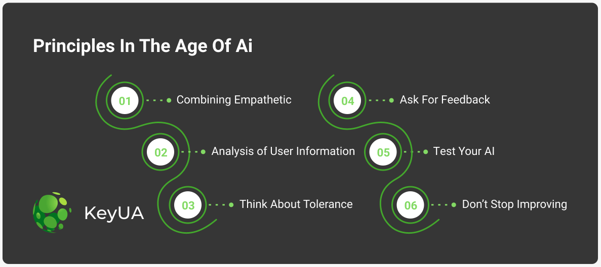
#1 Combining Empathetic and Analytical Approaches
The design of an application should reflect the needs of the users for whom it is being created. AI must take an analytical approach to empathize with users, understand their current problems, and propose solutions. This is primarily based on understanding how a user navigates through the product. So, when speaking of design, the interface should be produced so that the system can collect as much information as possible about customers’ behavior and needs. At the same time, users should also be comfortable interacting with the product. Such methods allow you to identify client pain points and the opportunities that the system has to offer. The AI software product design principle is based on helping the user even before they ask for it.
#2 Collection and Analysis of User Information
Another important principle is the synthesis and understanding of the data that can be obtained about the end-user. This is necessary to make the process of interaction with the product more efficient and useful. Determining what capabilities the user needs all the time allows devs to focus on creating relevant algorithms. In this case, the design is developed for a particular function that solves specific customer tasks.
#3 Think About Tolerance
People tend to make mistakes. Since artificial intelligence is created in the likeness of human thinking, products can also work wrong sometimes. Therefore, a user should be able to forgive the AI for its mistake. The design should be created in such a way as to find the path to the client's tolerance. Let the application have certain features in such situations. For example, you can display a relevant joke on the screen or develop an algorithm that will apologize for the system’s mistake with a cute animal image. Such approaches touch the user and inspire approval. A cute and funny creature with a gentle voice is much better than an adult man’s metallic voice. This is a simple example, but it might not be suitable for all types of business. The tone of such functionality must be developed following the style and purpose of your product.
#4 Ask For Feedback
Artificial intelligence learns from users' experience. It learns from clients about what was right and which algorithm should be improved. Therefore, the next design principle is to ask the user to evaluate the services’ functionality and quality. The more data developers get from users, the more convenient and reliable they can make the product engine. Thus, the design should assume functionality in which users can share their impressions of using AI to solve their problems. Another thing is that customers don't want to spend a lot of time leaving reviews. So, the layout should be developed so that it does not take the user a lot of time to share their experience.
#5 Test Your AI
Here we are talking not only about the design but also about product functionality. Testing is a great way to put yourself in the user's shoes and assess how comfortable it is for them to interact with the interface and application algorithms. It is necessary to test the predictions and results of the conclusions of artificial intelligence and evaluate how it displays information on the screen. Even when it comes to large amounts of data, it should still be easy for the end consumer to understand.
#6 Don't Stop Improving
This principle of good product design follows from the previous one. The bottom line is that any version will never be the perfect design for a product. It is crucial to consider all the trends in AI-based software development and timely implement them into your product to keep up with the times. The concept of continual improvement is to change the approach to product design over time and to update outdated technologies, replacing them with more progressive algorithms and externalities.
The Best Product Design Principles We Apply at KeyUA

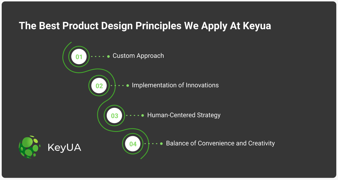
Custom Approach
We believe that there is no one size fits all solution. Our development team takes a fundamental approach to the creation of any digital product. We do not use any patterns or general solutions. A personalized approach allows us to create first-class applications with rich capabilities that address underlying customer problems.
Implementation of Innovations
At KeyUA, we also believe that innovation empowers businesses to thrive. We use new approaches in building designs and developing application algorithms to simplify the user experience with software as much as possible. Our developers are continually exploring new technologies, refreshing their knowledge and approaches to design. We also have internal algorithms for assessing the feasibility of specific technologies.
Human-Centered Strategy
All layouts that we create aim to ensure that the user can successfully and efficiently move around the product. It is important to us that they can intuitively work with the application and get the greatest satisfaction. Our main goal is to fully focus on the end-users’ needs to gain their trust and help them have a positive product experience.
Balance of Convenience and Creativity
Another rule that we adhere to when building designs is flexibility, which allows us to make a product moderately creative while being quite convenient. If the design is too fashionable, it may be incomprehensible to the user or repulse them with its variegated colors. At KeyUA, we design templates based on customers’ interests in such a way as to make the interface as pleasant as possible.
Final Thoughts
A quality product largely depends on the principles and approaches that the company implements and applies. Therefore, it is imperative to choose a reliable service provider who can qualitatively develop the necessary functionality and interface so that the software is pleasant to use and helps solve its users’ problems.
Our company has a proven track record of delivering top-notch applications for businesses of all sizes. For over 12 years, we have been developing and implementing unique designs that allow users to successfully and intuitively handle applications.
Help your business grow with proven design principles and increase your audience with a powerful software development team.
Contact Us


 Unit 1505 124 City Road, London, United Kingdom, EC1V 2NX

Comments
Leave a comment