
The marketing success of match-making apps directly depends on their usability. People tend to use software that instantly solves their problems and is fun to use. To design a dating app that will win a broad audience, you should think like an end-user. Check how to create a dating app in terms of functionality.
Any discomfort is a reason to skip using the application. That is why creators do their best to make sure users enjoy their experience and are happy with the result. Find out how to design a dating app interface that will keep users engaged and satisfied.
Dating App Design Tips
A well-thought app logic and robust set of features are useless if its interface is cluttered or hard-to-use. It should not be a brain teaser for a user to get to the desired result. Here are some recommendations on how you can create a dating application design that users will love.
Tip 1: Design Like a Dating App User
When working on a new project, 9 in 10 designers rely on today’s trends, check the UI samples on popular resources like Behance or Dribble to get inspired. Then they make a few wireframes based on what they saw and move on to the final visual design mockup.
Don’t follow that approach.
The only way to design a dating app that will win users’ love is to build an interface upon their real needs and tastes. It would be helpful to test the existing dating apps to see their strengths and weaknesses and finally invent a new design utilizing all those findings.
Tip 2: 1 Screen = 1 Action
A perfect UI motivates users to perform target actions unthinkingly. The more options you offer for a single action, the more time a user needs to decide which to choose. The primary purpose of the app is to turn a visitor into an actual user. That is why the signup and onboarding flows must be maximally straightforward.
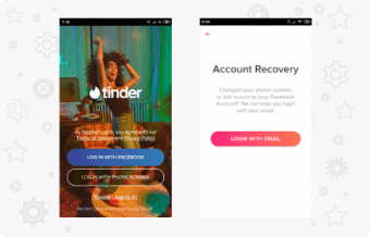
Tinder Sign Up Screen (source: ux.pub)
For instance, Tinder offers a user to register either via Facebook or a phone number. There is an additional option to sign up via an email address. Still, it is hidden under a “Trouble Logging In?” link. The app doesn’t offer all available options at once. It limits your choice, showing the most convenient variants first. It’s a wise decision in terms of simplicity.

Tinder Registration Process UI (source: ux.pub)
Split the registration process into a few steps, not outputting the whole questionnaire to provide necessary profile details on a single screen. If your app requires filling up a detailed profile for your matching algorithms, ask up to 5-6 questions at once with the ability to enter the rest of the details later. Users want to spend minimum time on preparations before they get inside and start looking for potential partners.
Tip 3: B = M + A + T
Behavior psychology is the basis of building proper dating app design. One of the fundamental principles is described in the Fogg Behavior Model:

The Fogg Behavior Model
To act, people need a desire, capability, and a trigger that will push them to action. While it is hard to manipulate motivation, you can create maximally simple conditions that will engage users for action. Make action elements noticeable, do not overload the screens with unnecessary elements to perform the main action.
When you navigate the customers, you can lead them anywhere. For dating app creators, that means within a simple-to-follow user interface, you can make users perform actions you need to fulfill your marketing goals. - Olga Voronkova, Marketing Expert at KeyUA

Phone Number Completion Screen in Tinder
Tip 4: Minimalism
Minimalism is one of the main UI/UX design trends over the past few years. A high-quality design for a dating app should be almost unnoticeable. Anything that distracts the user and pulls them away from solving their problem should be removed. Forget about using too many gradients or complex animation that takes additional time between transitions.
Minimalistic Design Concept (source: uplabs.com)
Iterate while building your dating app design until you get the screens free from any non-functional elements. Aim to develop a smooth logic structure that directs users from action to action. Also, balance decorative elements wisely, not overloading the app with fancy quirks and gradients. Choose 1-2 font types and keep the proper font sizes.
Tip 5: Give Users Control
People don’t like the feeling they lack control of the situation. Do not bombard users with pop-ups offering to try this feature or that. It distracts and annoys. Imagine a UI as a car that takes the user to their desired destination. Give them the keys, let them enjoy the trip! As a result, you will get a loyal customer base satisfied with the experience.
Every completed action should end up informing a user that everything is okay. It makes a user feel confident, controlling the process.
Tip 6: Gamification
Dating apps are something more than simply a tool for finding someone to date. Now it has become entertainment, a way to kill time and boost self-confidence. Here are the main drivers for using the Tinder app by millennials, according to the survey by LendEdu:

Why Millenials Use Tinder? (source: lendedu.com)
As you see, an ego boost is what brings every 4.5 of 10 users to a dating app. The feeling of being desired together with other positive emotions make online dating patterns a sort of addiction. Gamification dating app UX design helps keep users interested and spending more time on the app.
The most prominent example of online dating gamification is swiping technology. A user swipes right or left, finds matches, decides whether to message their matches or ‘keep playing.’ Another gamification approach is ranking users by activity, popularity, subscription type, etc. Think about the ways to turn dating through your app into a fun game. Achieving small goals while surfing through the matches makes users feel more confident.
Tip 7: Privacy and Profile Customization Balance
Dating app users aim to find people who perfectly match their preferences in look, tastes, hobbies, goals, lifestyle, and other criteria. Still, they are worried about any information they share with strangers. It partly explains why some dating applications offer limited profile capabilities to let people keep their privacy secured. When you design your own dating app, think about keeping user profiles private: display some basic information in user cards until two users match each other and start communication.
Another variant is letting users decide what to keep private and what to make public from their profiles. Many users look for affairs while being in a relationship with someone. They do not want to meet anyone from their job or family while dating online. For that reason, some apps suggest importing the contact list from mobile phones to prevent user’s contacts from seeing their profiles in search results or match lists.
Tip 8: Dose Marketing in Your UI
Users get annoyed being shown numerous offers to buy something within a dating app. While app owners aim to earn maximum profit, they should wisely integrate all their marketing goals into the UI/UX logic. Softly bend users to apply for paid features, incorporating them into your dating app UI design. They should not interrupt user flows and distract from the primary process.
Tip 9: Please Use Your Visuals
Visual elements of the dating app design should bring aesthetic pleasure from using your product. They should reflect your brand uniqueness, align with the latest design trends, and provide utmost usability.

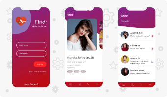
Bumble App Design (source: medium.com)
A design for a dating application allows for using a bright color palette that triggers positive emotions. The right colors also put a user in the right mood. If your product is focused on finding passionate affairs, a red, coral, orange palette may be the right choice. If your product is targeted at serious relationships and getting married, it makes sense to use more tempered colors. A dating app for seniors should feature bigger fonts and calmer colors to make it comfortable for the eyes.
Tip 10: Interactions That Minimize User Efforts
The design of interactions requires special attention because many of them are irreversible to a user. For example, a user occasionally swipes someone he likes to the left and cannot reverse the action (without upgrading to a paid plan).

Mobile Touchpoints for Comfortable Navigation (source: slideshare.net)
Another problem within today’s large smartphone screens is managing navigation with one finger. Locate the navigation bar so that it is possible to perform any interaction with one finger.
Another problem is complicating the user flow with unrecognizable icons. Make sure that each button action is clear from its appearance. No hidden meanings or allegories, please. If a user sees a button (or an icon), they should intuitively understand what happens if they tap.
Get a robust UI/UX design for your dating application that utilizes the best modern practices for user’s comfort with KeyUA.
Consult Our ExpertsDating App Design Samples
The theory itself is useless without practical implementation. Here are a few design samples for your inspiration, both concept templates and real ones. See the weaknesses and strengths of each example.
CatchMatch
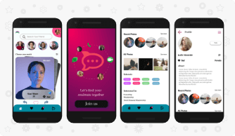
A CatchMAtch UI/UX design concept for a mobile dating app allows finding matches based on interests. It features the same swiping technology as Tinder and Bumble yet offers some extended functionality when swiping right. Besides ‘liking,’ it also allows saving a user’s photos, messaging to the liked profile, or even sending a gift.
The first app screen invites a user to ‘Join Us,’ which is a bit awkward, as a user needs to go to another screen to sign up. Then the video prototype shows the feed screen displaying who’s from your matches online, a list of new profiles to like, and some other cards menu on the bottom. The first thing that hits the eye is a decorative font type that can be hard to read due to a narrow letter fit.
The navigation menu is on the bottom, which is good, featuring four icons:
- Home
- Favorites
- Notifications
- Chats
The overall impression from this UI/UX concept is positive, as the screens are not overloaded with elements. It is enough space between elements, no mess around the primary app features.
Sweetheart Social App

Sweetheart Social App concept is an exciting implementation of the latest design trend - glassmorphism. It is based on semi-transparent layers on colorful backgrounds that imitate frosted glass. There is no real Android or iOS dating app like that on the market yet. So it is a worthy idea for a new product.
Sweetheart UI features a bright yellow-background welcome screen that definitely engages a user to join the app. The rest of the screens are made in calm pastel tones that will be pleasant for the eyes even if spending hours within the app. The logo design and the buttons are all pink. The general tone temperature is warm, which is traditional to online dating services. However, the overall design seems like it’s targeted mainly at a female audience or younger users.
The developers took care of usability, as all navigation is on the bottom, which is comfortable to manage with one finger. There is a screen displaying users nearby as icons on the circles around the logged-in user icon: it would be interesting to see how that option would work if there are too many people around. There can be issues with tapping on a specific user icon: there is no zoom feature, judging from the screen elements.
There is no prototype demo, so there is no ability to judge regarding transitions from screen to screen and animations. Yet, such UI/UX design graphics deserve attention.
Tinder vs. Bumble
A lot has already been said about Tinder UI in this review. However, it is still interesting to compare the interfaces of the two giants of the online dating industry. Apart from the same minimalism on signup pages, it is interesting how both apps ‘speak’ to a user.

Login Steps In Tinder and Bumble
Bumble asks questions like an interviewer, in a pretty standard manner to most UIs. Tinder uses active wording like “My sexual orientation is...” that helps to create a cozier atmosphere while collecting the necessary profile details. Notice that both screens feature a progress bar on top. However, it is hard to recognize it on the Bumble screen: the dark bar on the dark background is unnoticeable.
When a user is finally registered and moves to match cards, both apps show a nice tutorial on managing cards.

Tinder and Bumble Profile Views
Bumble has a simpler navigation bar, as some buttons are hidden under a menu icon. All actions with user profile cards are irreversible unless you are a paid subscriber. That’s fair in terms of business, yet it annoys free users who are more than 90% of the entire customer base.
Just evaluating UI/UX without considering functionality, both apps are great to interact with. These are definitely two of the best dating app design solutions in the industry. The developers did an excellent job implementing fast interactions: users move through the screens in just a moment, no time wasting that is highly important for usability.
Final thoughts
Today’s UI/UX design for a dating app is more about behavior psychology than artistic value. People want a dating app that will give easy and fun experiences, help boost self-confidence, and provide an unlimited choice of potential partners. The best app designers and developers actively analyze the wishes and demands of their target audience to make their product maximally comfortable and functional.
KeyUA engineers fully support this approach, applying it to every new project. Our company can help with your dating app UI/UX development to create a product with a unique, tangible value to end-users. Get a worthy graphic implementation for your product idea with our experts!
Looking for a skilled and experienced team to develop your dating app interface? Bring your ideas to KeyUA!
Get in Touch
 Unit 1505 124 City Road, London, United Kingdom, EC1V 2NX

Comments
Leave a comment